Brand Identity / Packaging
FIZZIQ
Big flavour. A brand built to stand out.
A bold identity and packaging system for a functional soda concept, bringing expressive typography, vivid colour and fruit-led imagery into one recognisable brand.
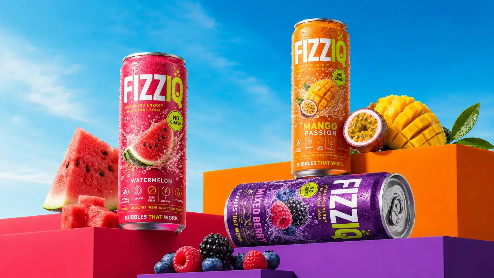
Make the range stand out. Keep the brand together.
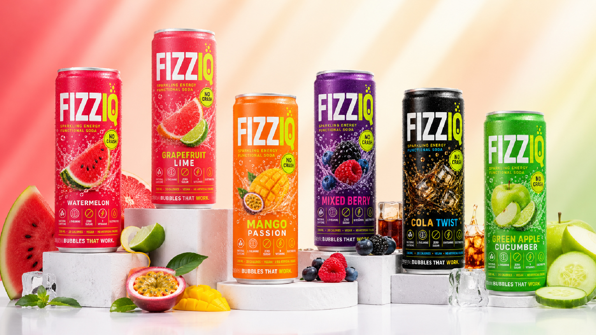
With six flavours to distinguish, the design needed both variety and consistency. The visual approach gives each flavour its own colour and fruit imagery, while keeping the wordmark and packaging structure recognisable across the range.
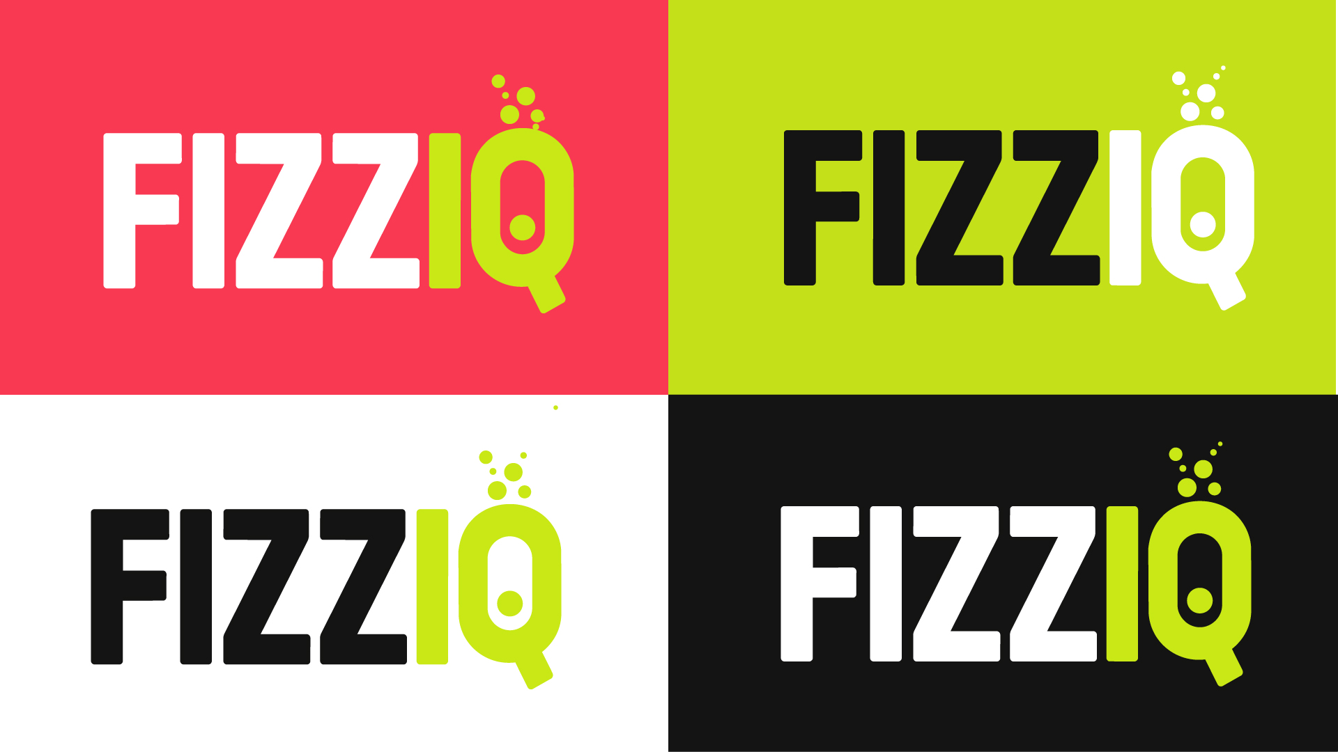
Six flavours. One recognisable system.
Each flavour has its own colour palette and fruit illustration. A shared layout holds the range together, balancing individual character with a consistent shelf presence across Watermelon, Mango Passion, Mixed Berry, Grapefruit Lime, Green Apple Cucumber and Cola Twist.
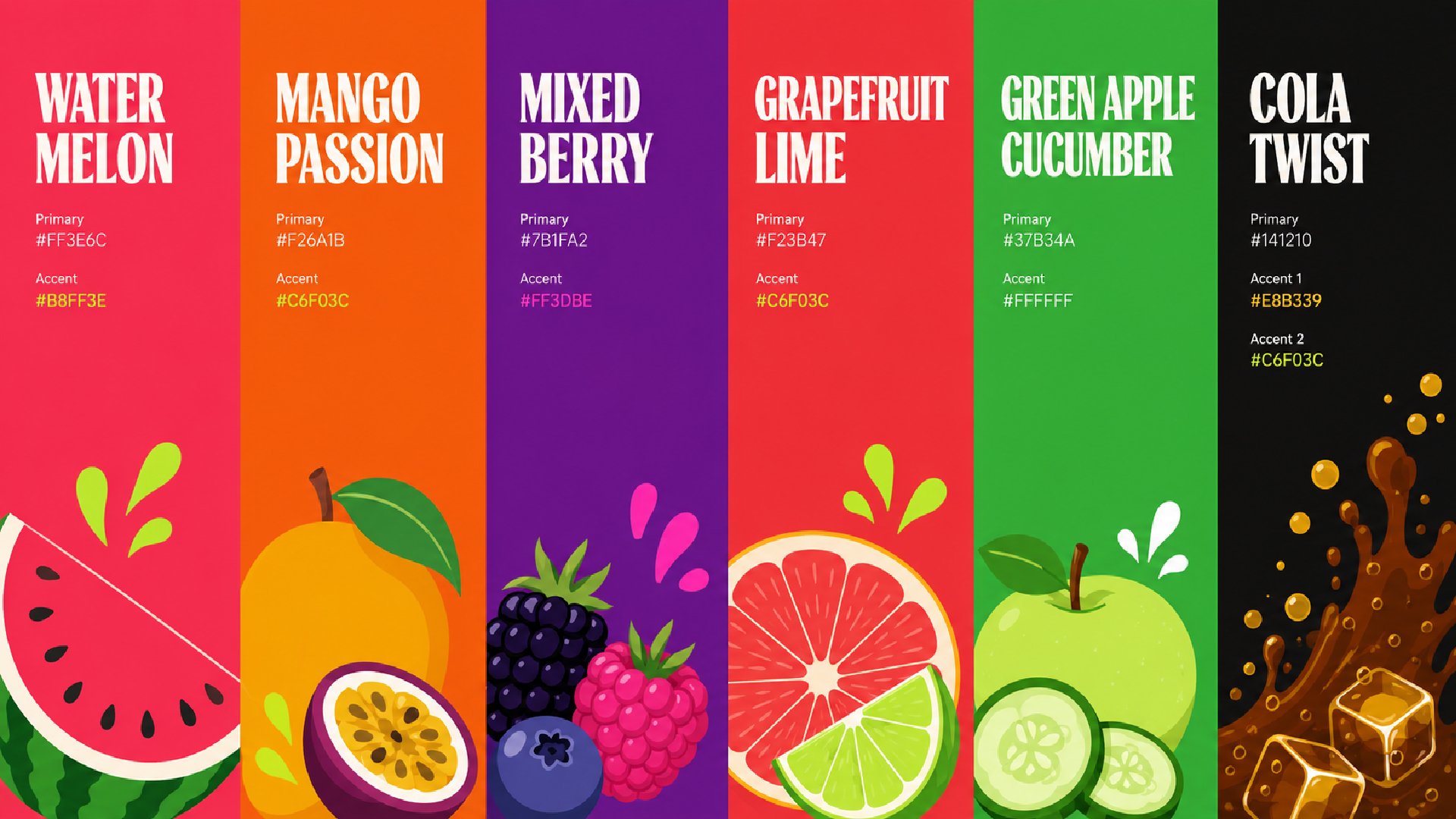
A bold wordmark with a sparkling detail.
Condensed letterforms give FIZZIQ a strong visual presence. The bubble detail in the Q adds a distinctive cue, connecting the identity to the drink itself. Bebas Neue Pro carries the headlines; Montserrat handles the supporting copy.
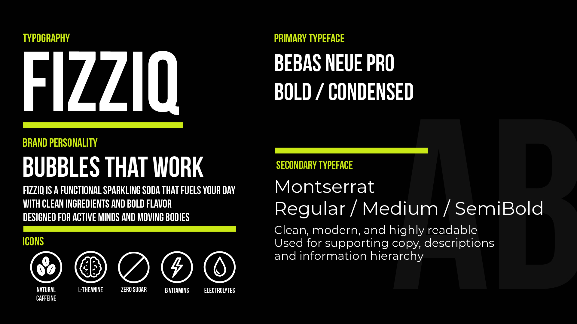
Every detail on the can earns its place.
The front label leads with the wordmark, flavour name and hero fruit. The concept’s benefit icons sit in a consistent strip below the main product information. The back label carries the full nutrition facts, ingredient list and the "FIZZIQ Crew" QR code.
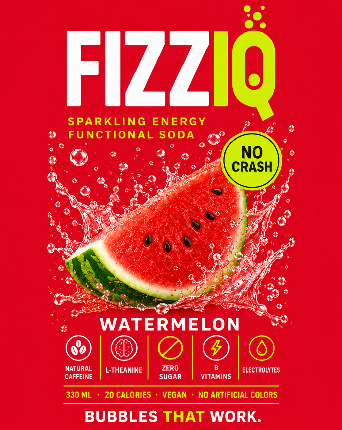
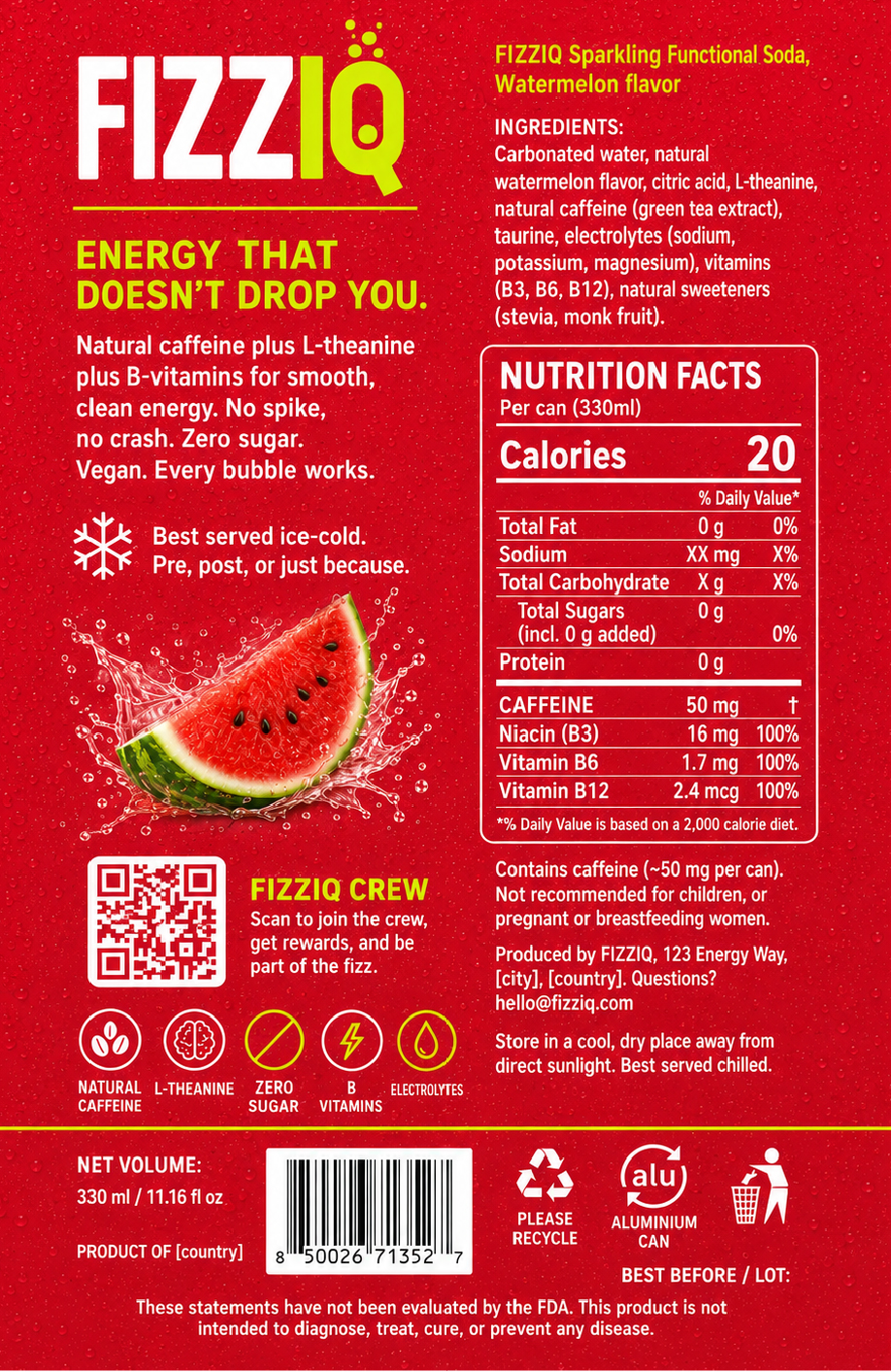
Made to feel as lively as it looks.
Fruit, colour and expressive imagery extend the packaging into a playful brand world. The same visual language carries from the can into lifestyle scenes and campaign compositions.
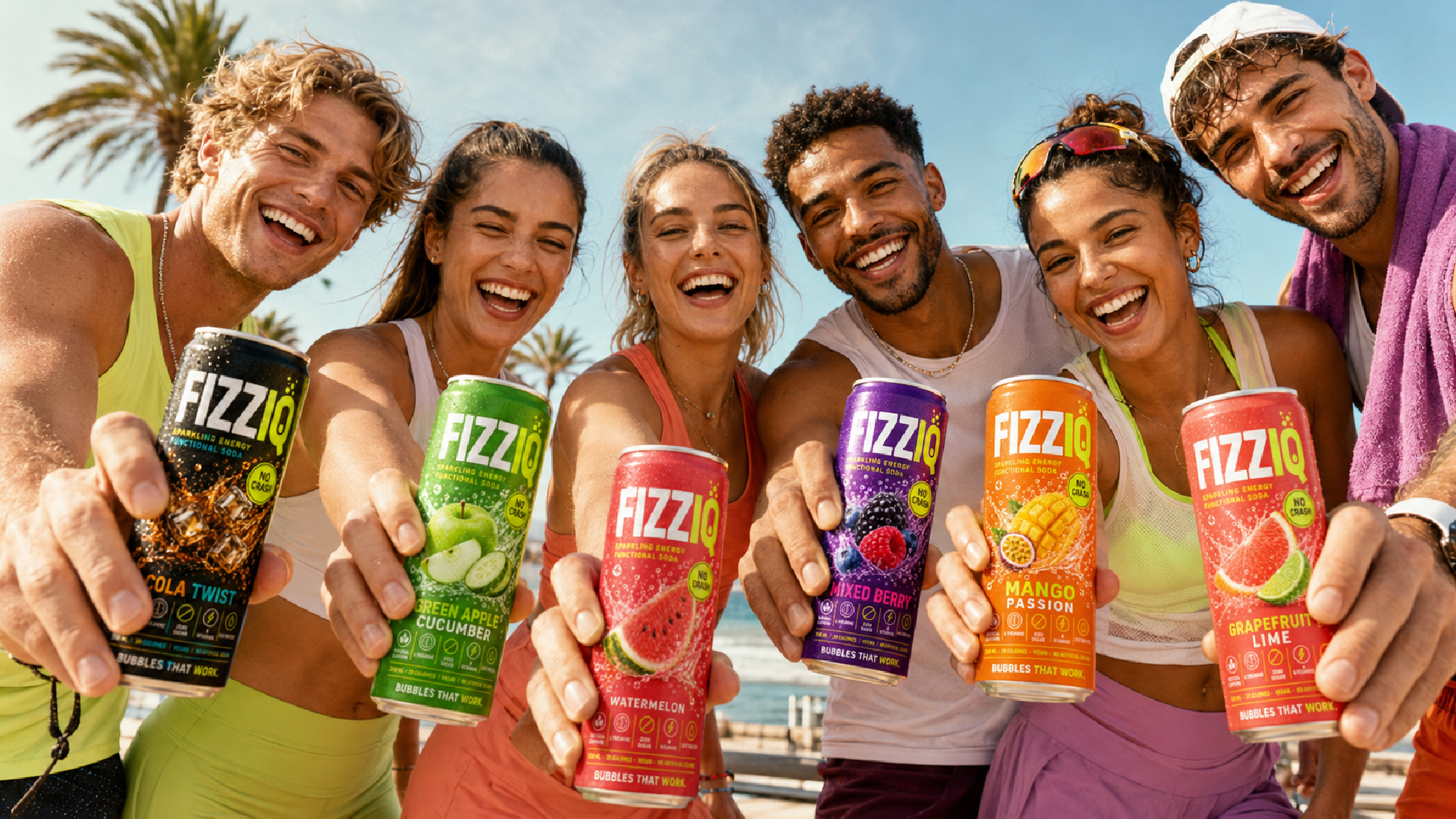
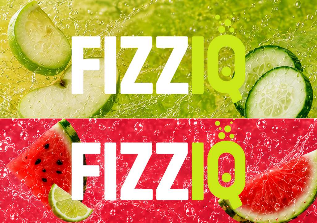
One identity. A bigger stage.
The campaign layouts scale the core elements up: oversized type, vivid flavour colours and a prominent can. Applications in Hebrew and English carry the same visual character into billboard, poster and digital formats.

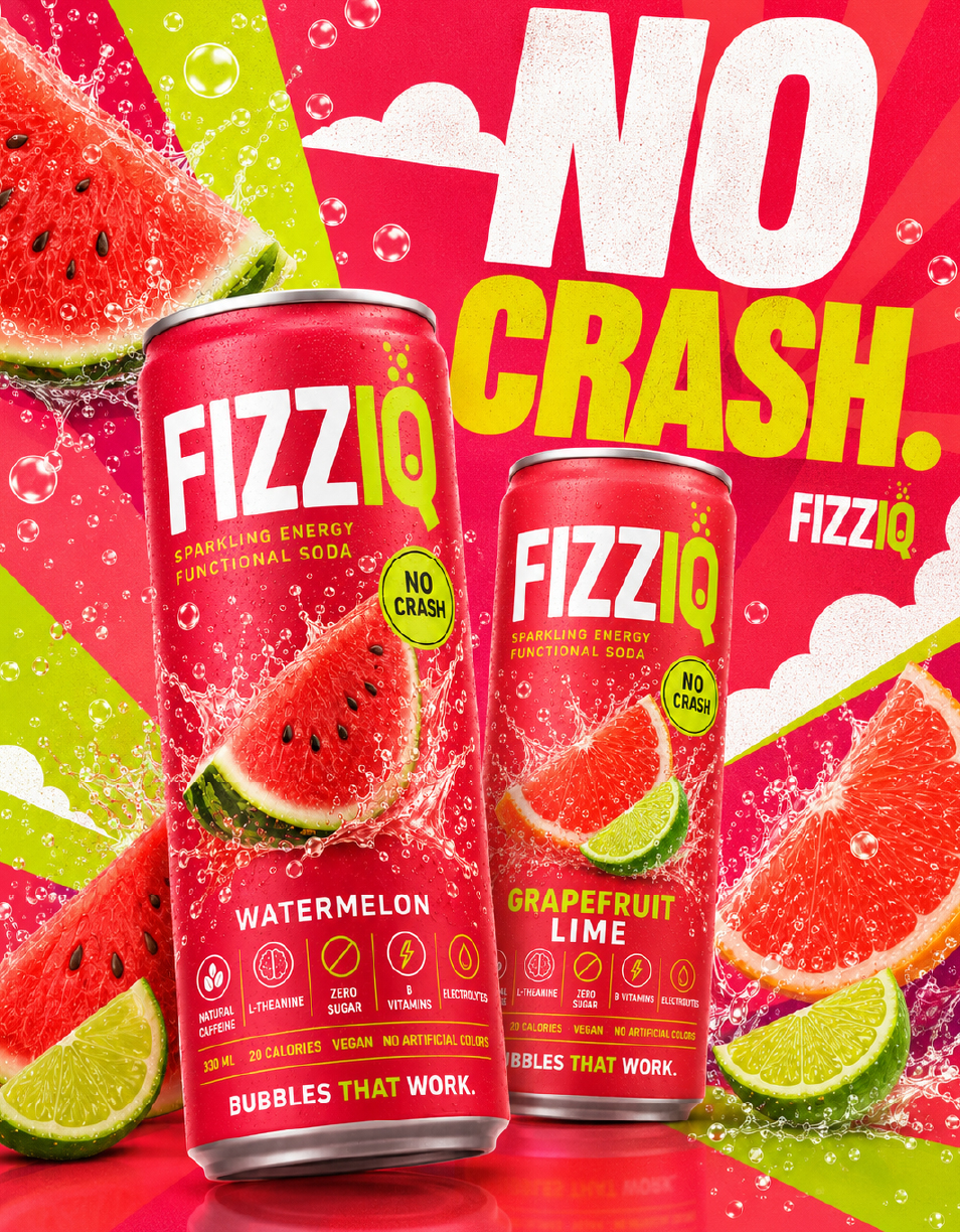
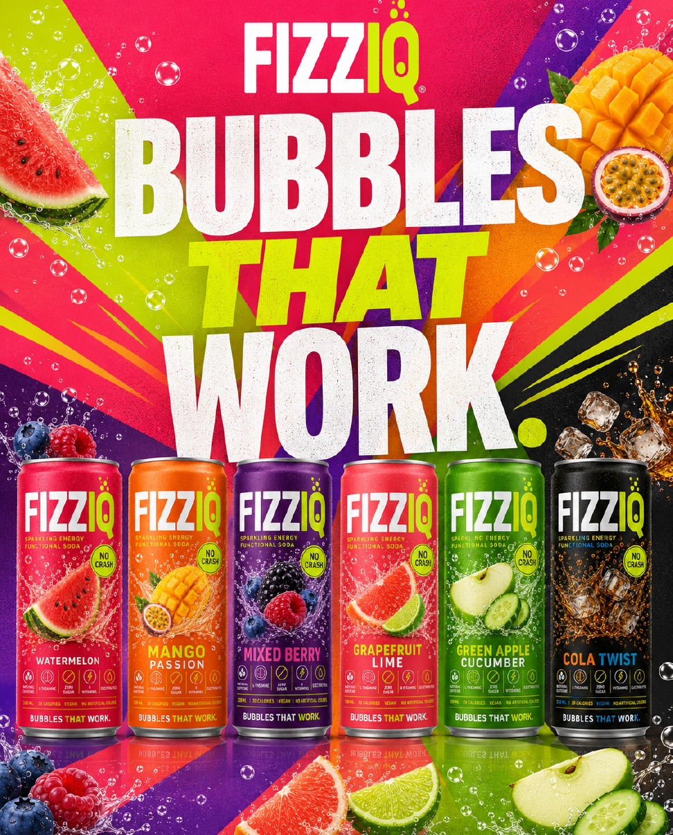
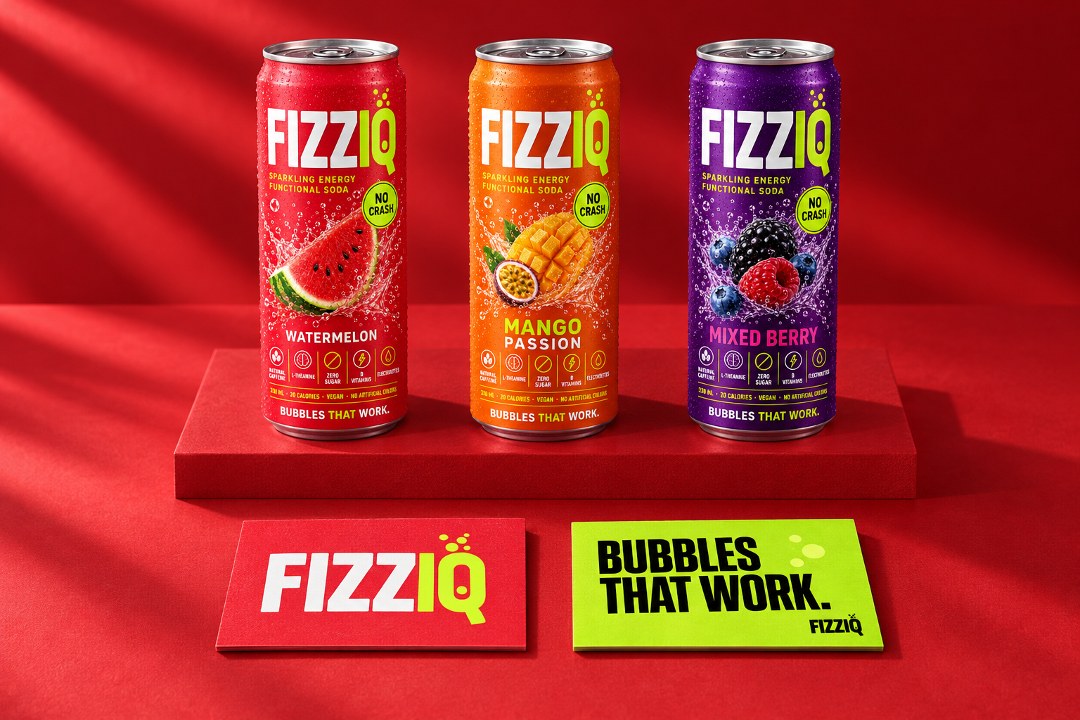
The system works at every touchpoint.
Business cards carry the same confident wordmark and lime accent. Social content scales the campaign language into vertical formats, keeping the brand unmistakable from a billboard to a phone screen.
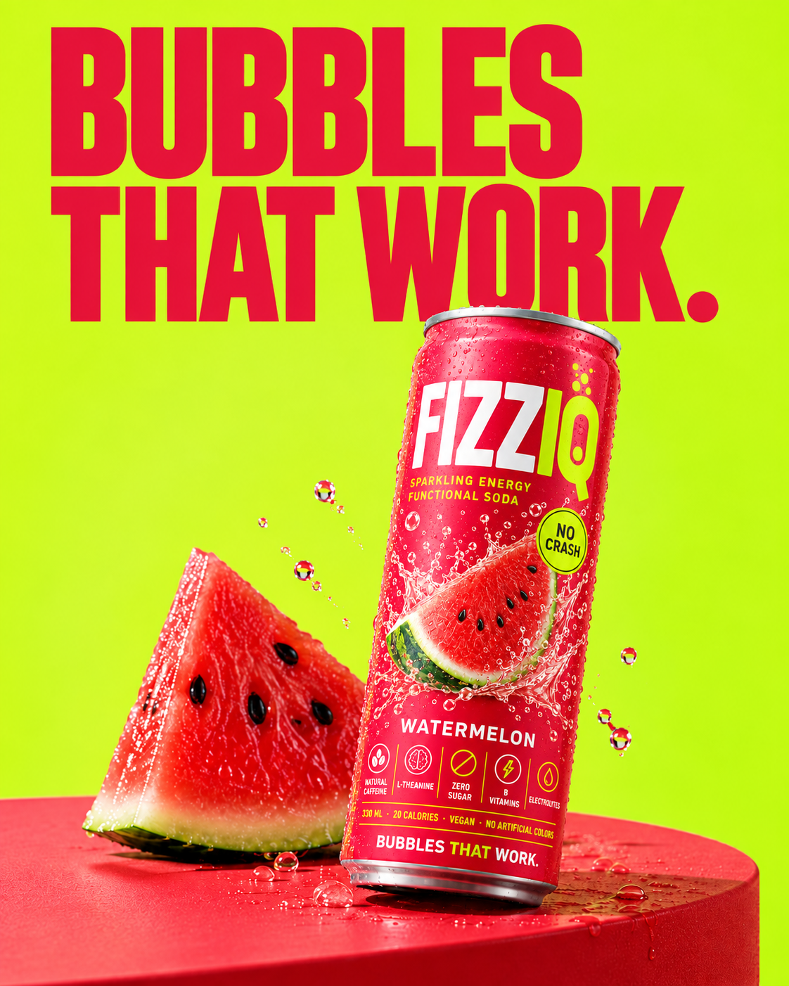
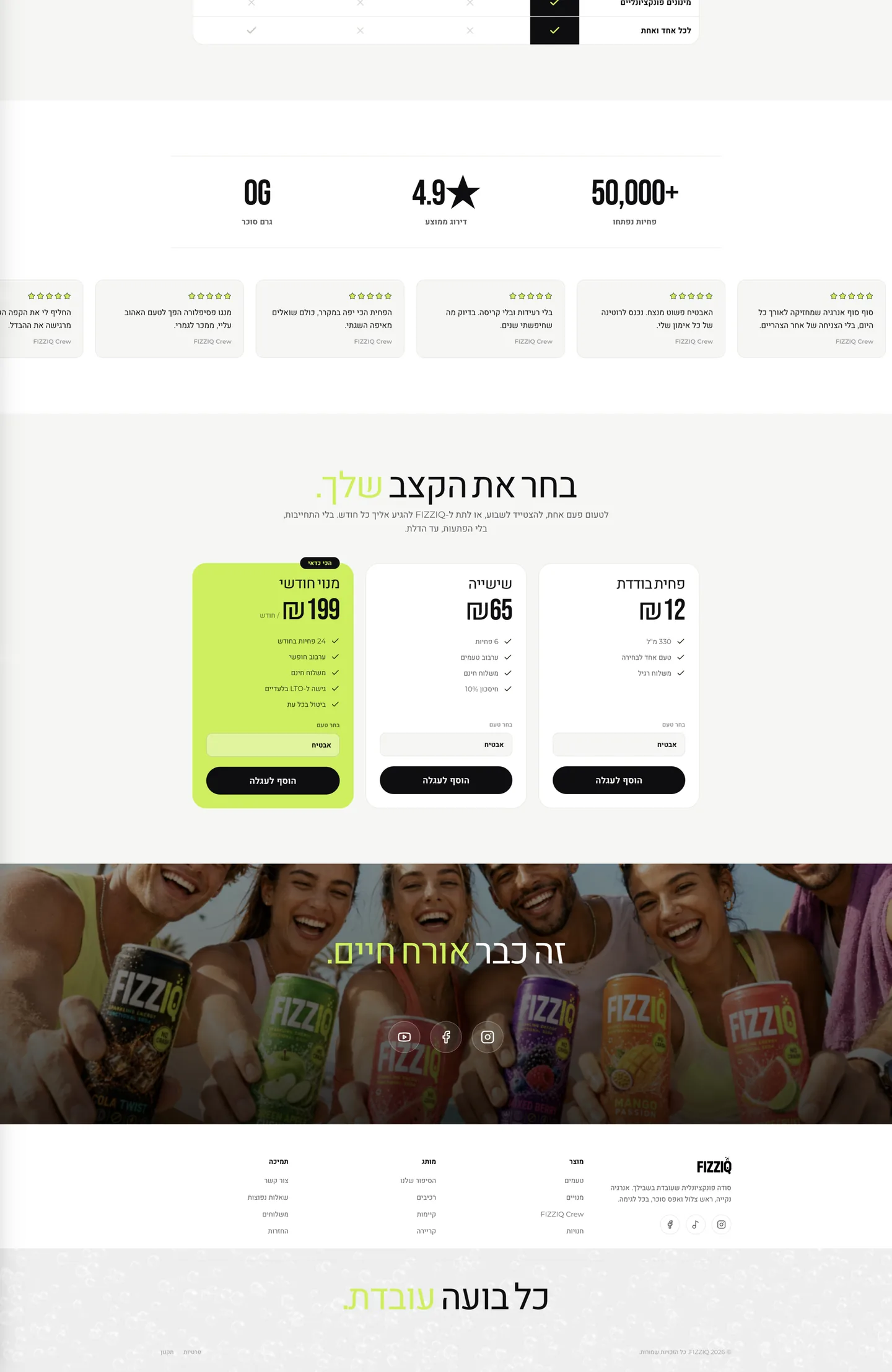
A website that behaves like the packaging.
Choosing a flavour recolours the entire experience at once. The same colour rules connect the packaging to the digital experience.
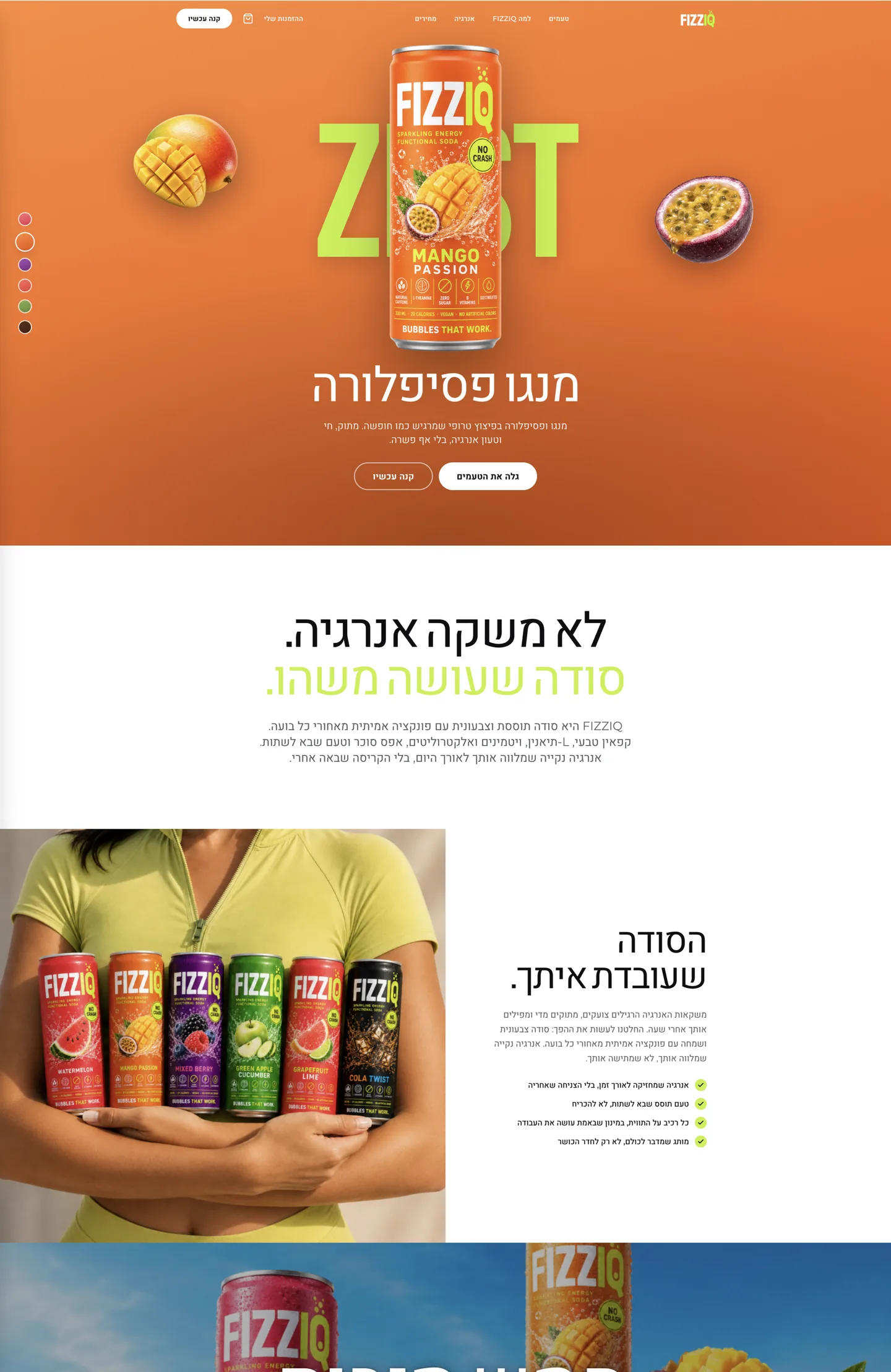
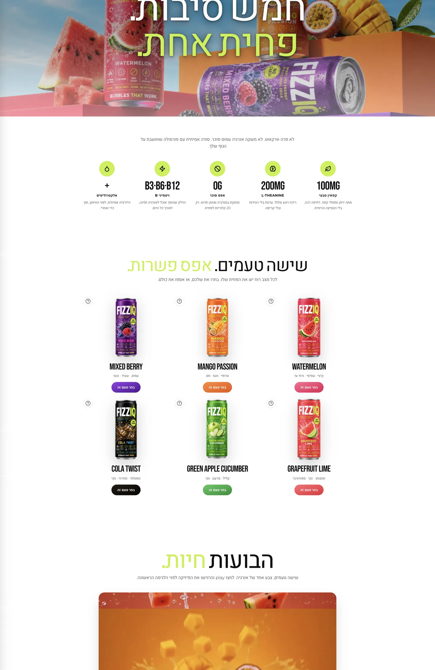
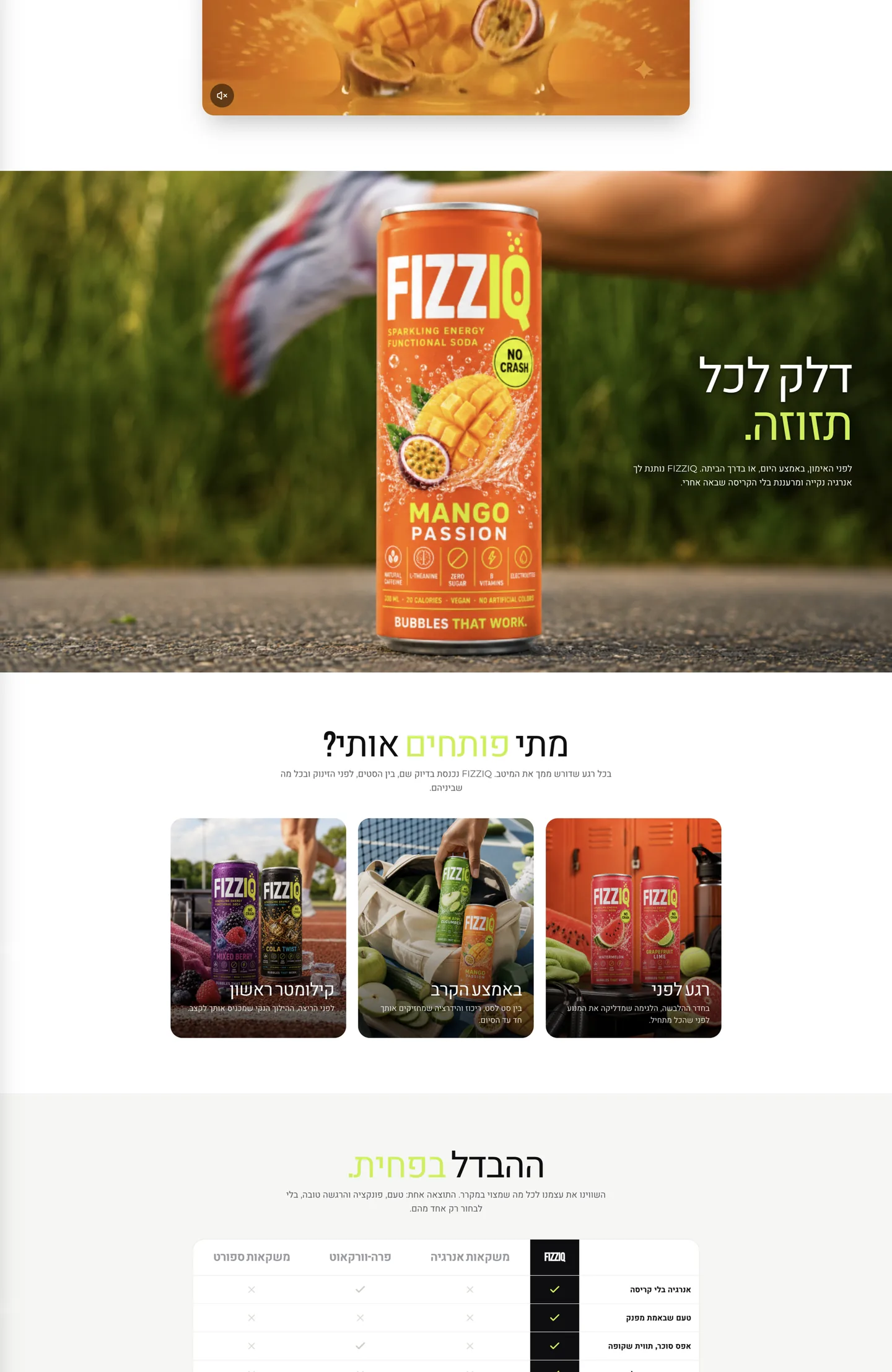
A consistent brand, from identity to application.
The project brings together a wordmark, a six-flavour packaging system and campaign applications through a shared language of condensed type, vivid colour and fruit imagery. The lime IQ in the logo and the icon strip on the can remain consistent across the applications.