Brand identity
Urban Roots
A plant boutique identity that brings a little nature into city life.
- Year
- 2026
- Industry
- Retail, plants
- Deliverables
- Logo, Visual identity, Color and material palette, Typography, Brand applications
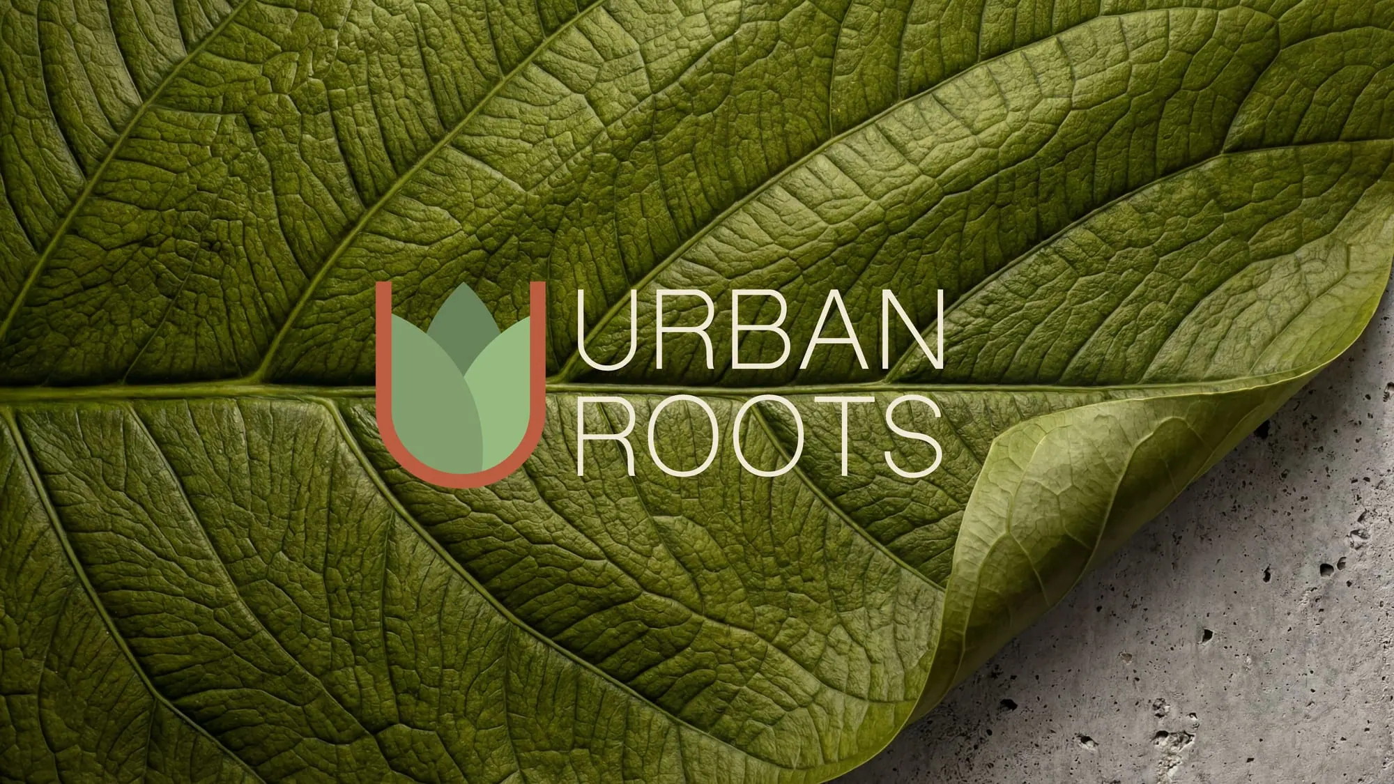
Giving an urban plant shop its own character
Urban Roots needed a visual identity suited to a city boutique. The brief combined the clean structure of urban spaces with the texture and warmth of plants.
Let the city and the plants meet
Geometric forms give the identity structure. Leaves, earthy colors and natural textures bring the plants into the picture.
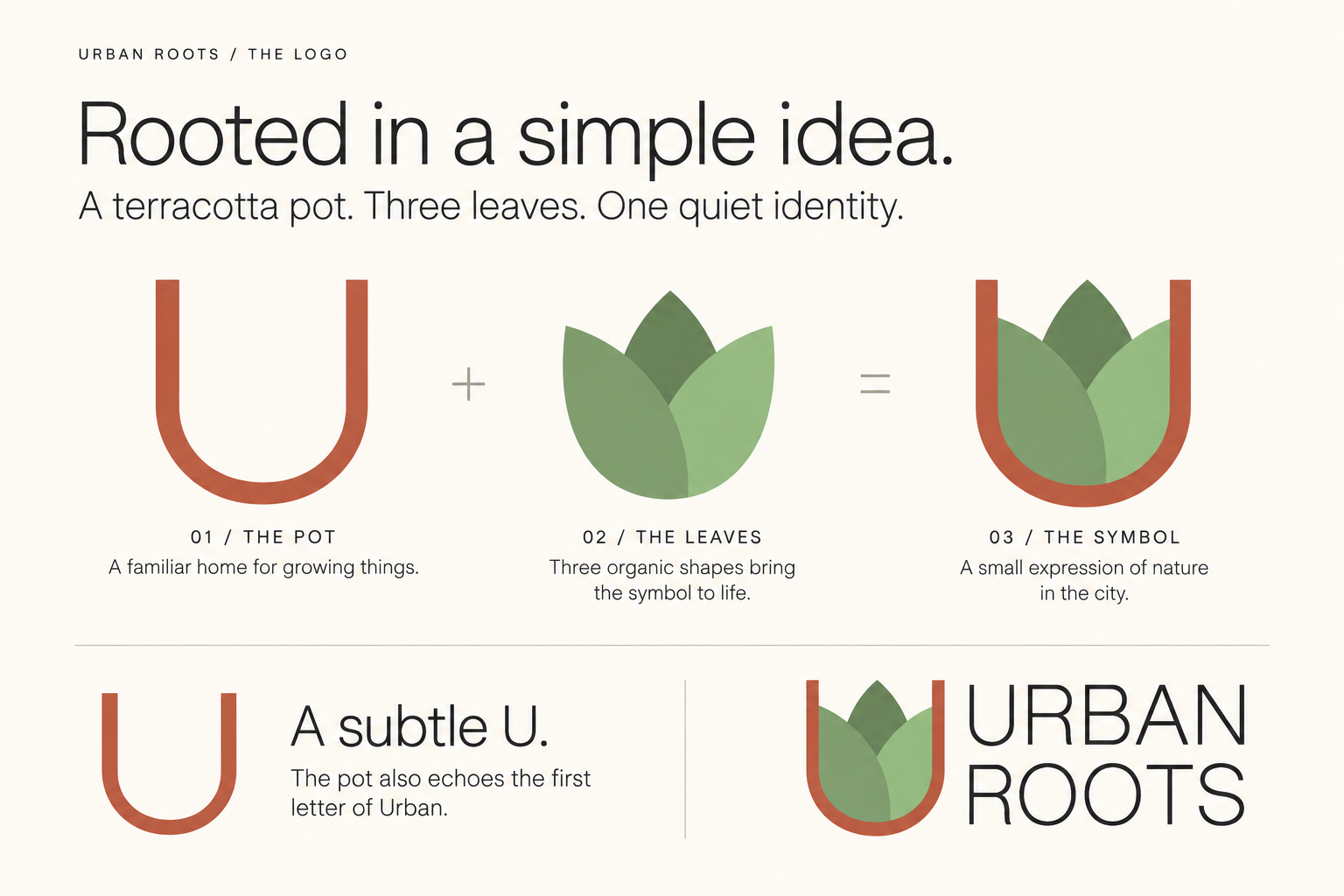
A growing mark
A terracotta pot and three leaves form the symbol, and the pot doubles as the U of Urban. The city and the plants meet in one compact, recognizable mark.
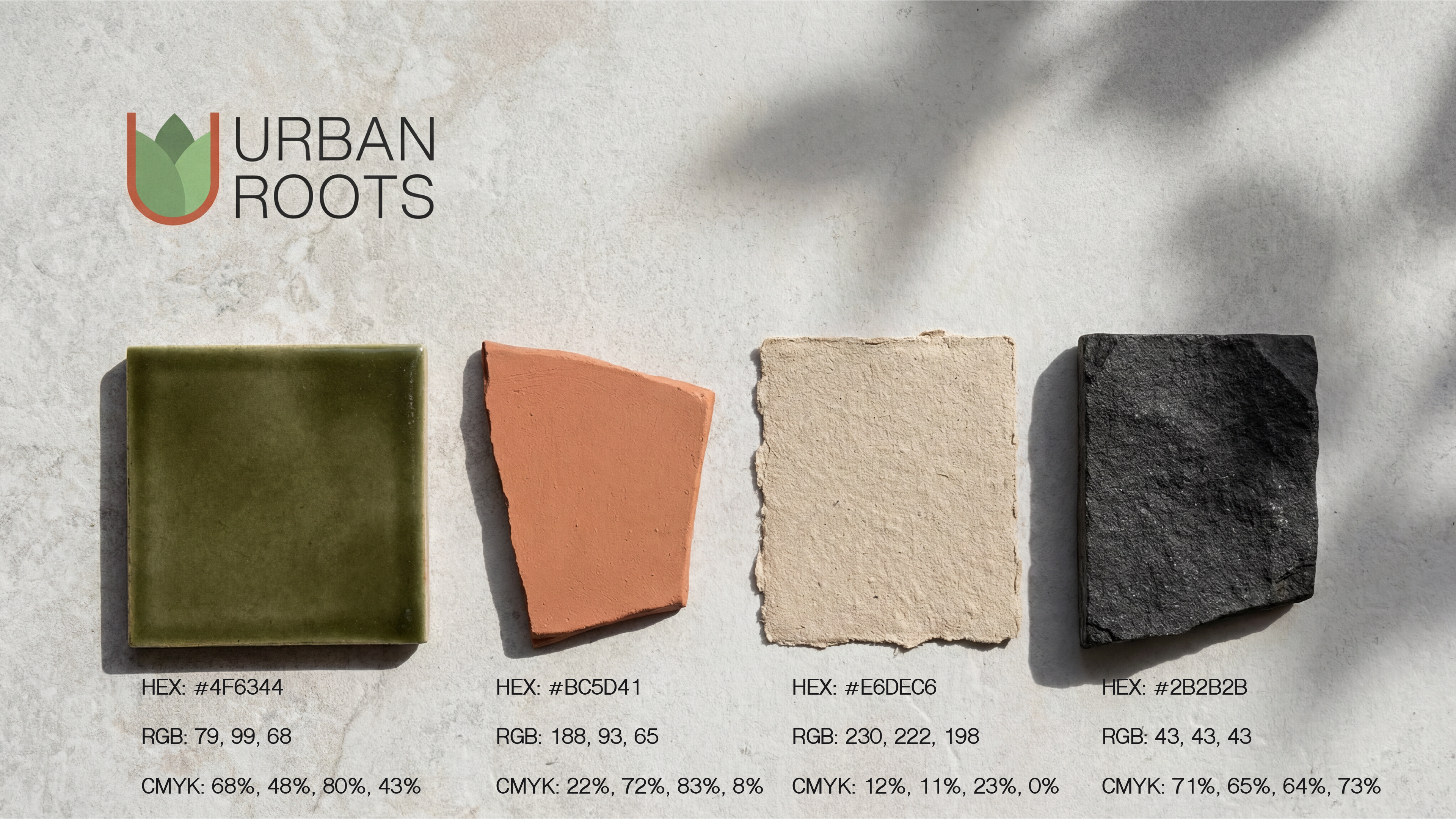
Colors drawn from the shop’s materials
Olive, clay, sand and charcoal form the palette. Together they work across packaging, signage and printed materials.
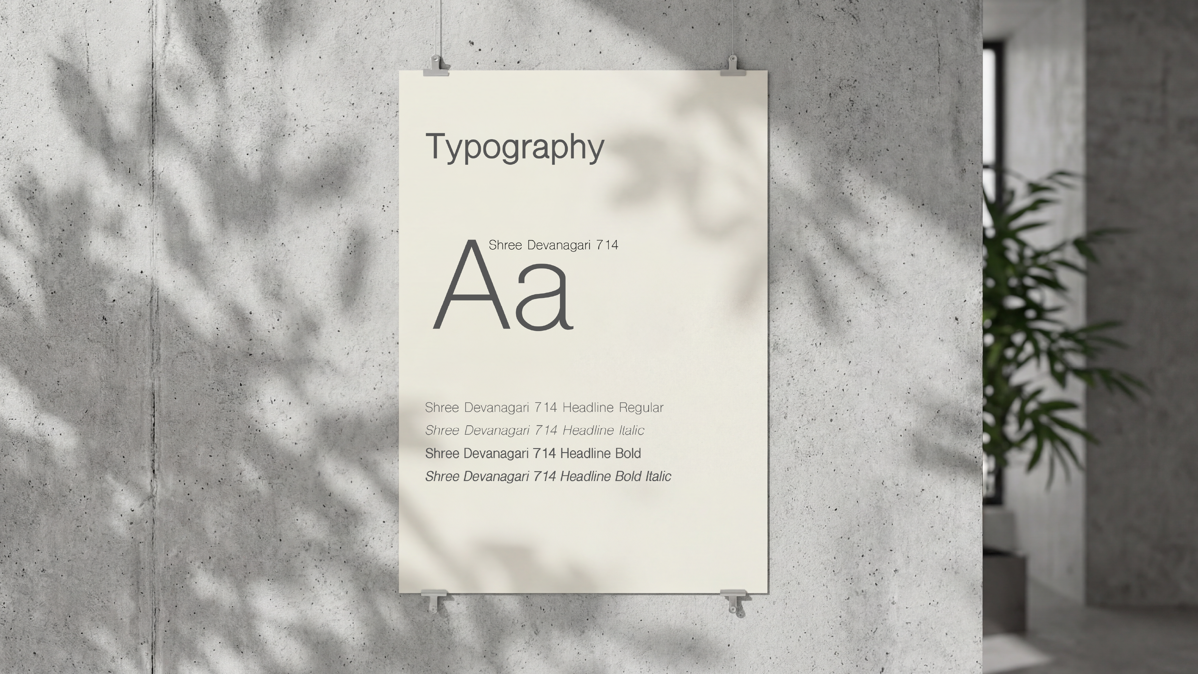
One quiet typeface
A single clean sans-serif, in regular, bold and their italics, keeps the lettering quiet, so the leaves and the materials carry the warmth.
Brand applications
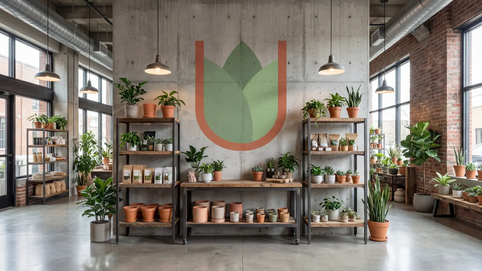
In-store branding
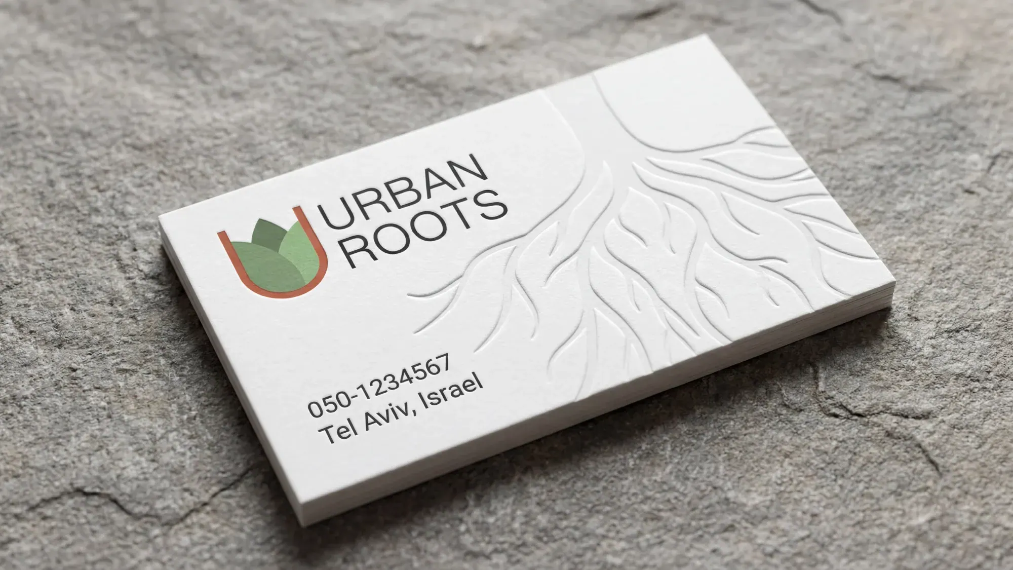
Business card
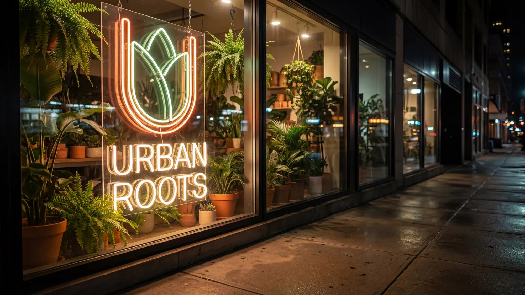
Storefront signage
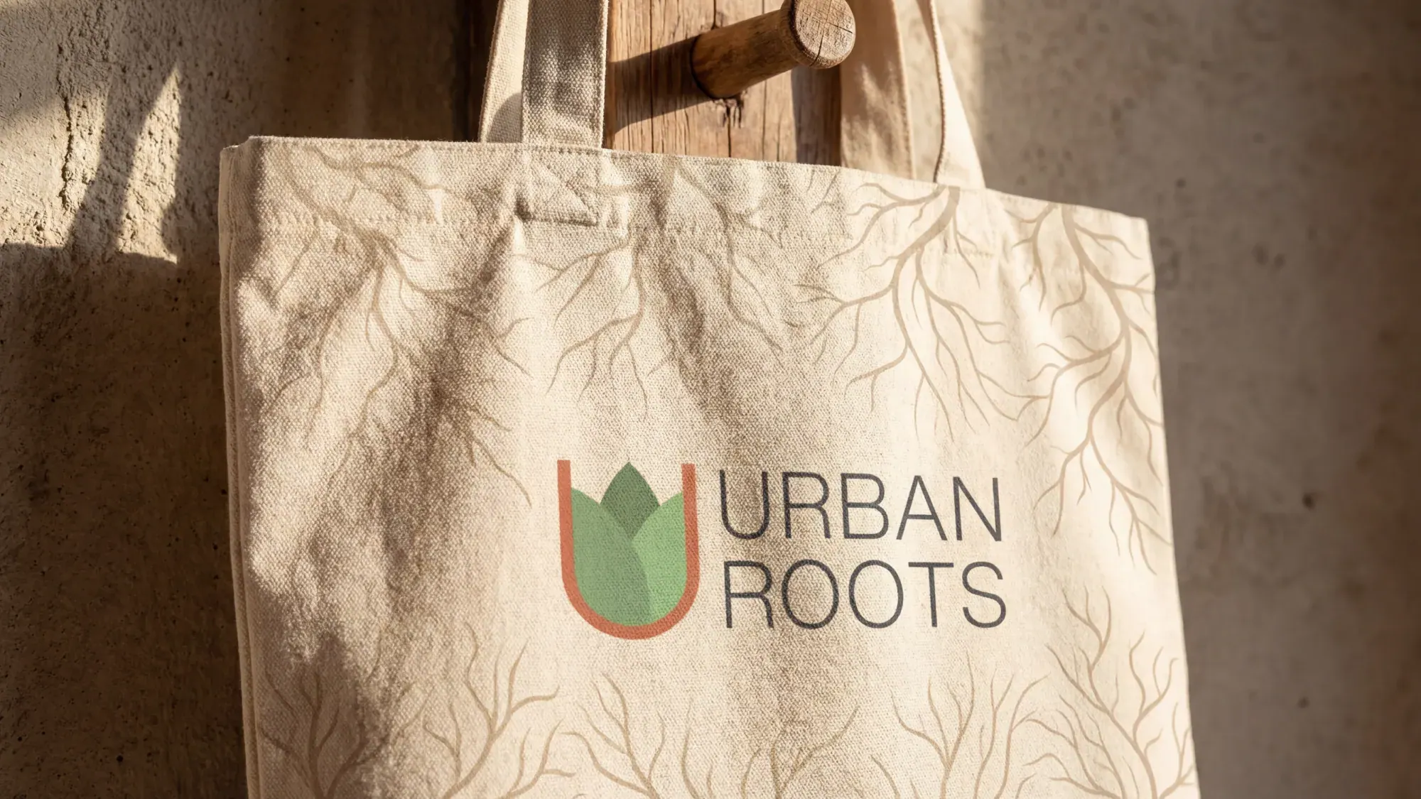
Tote bag
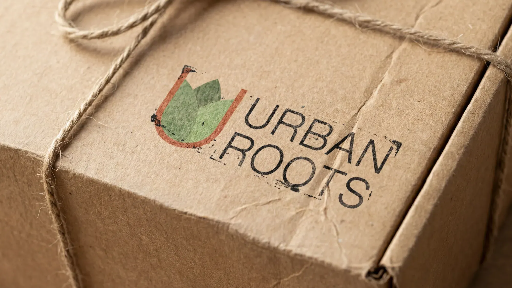
Packaging
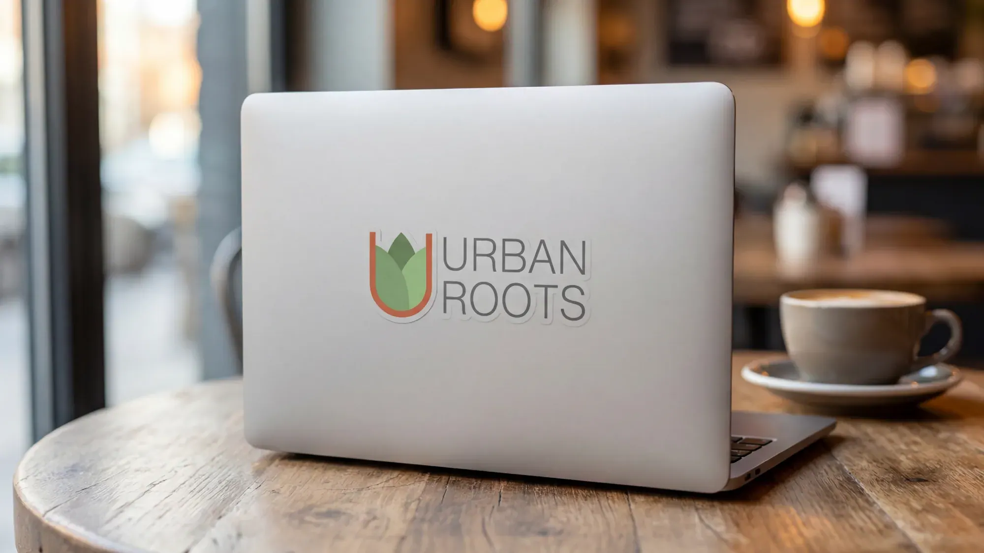
Laptop sticker
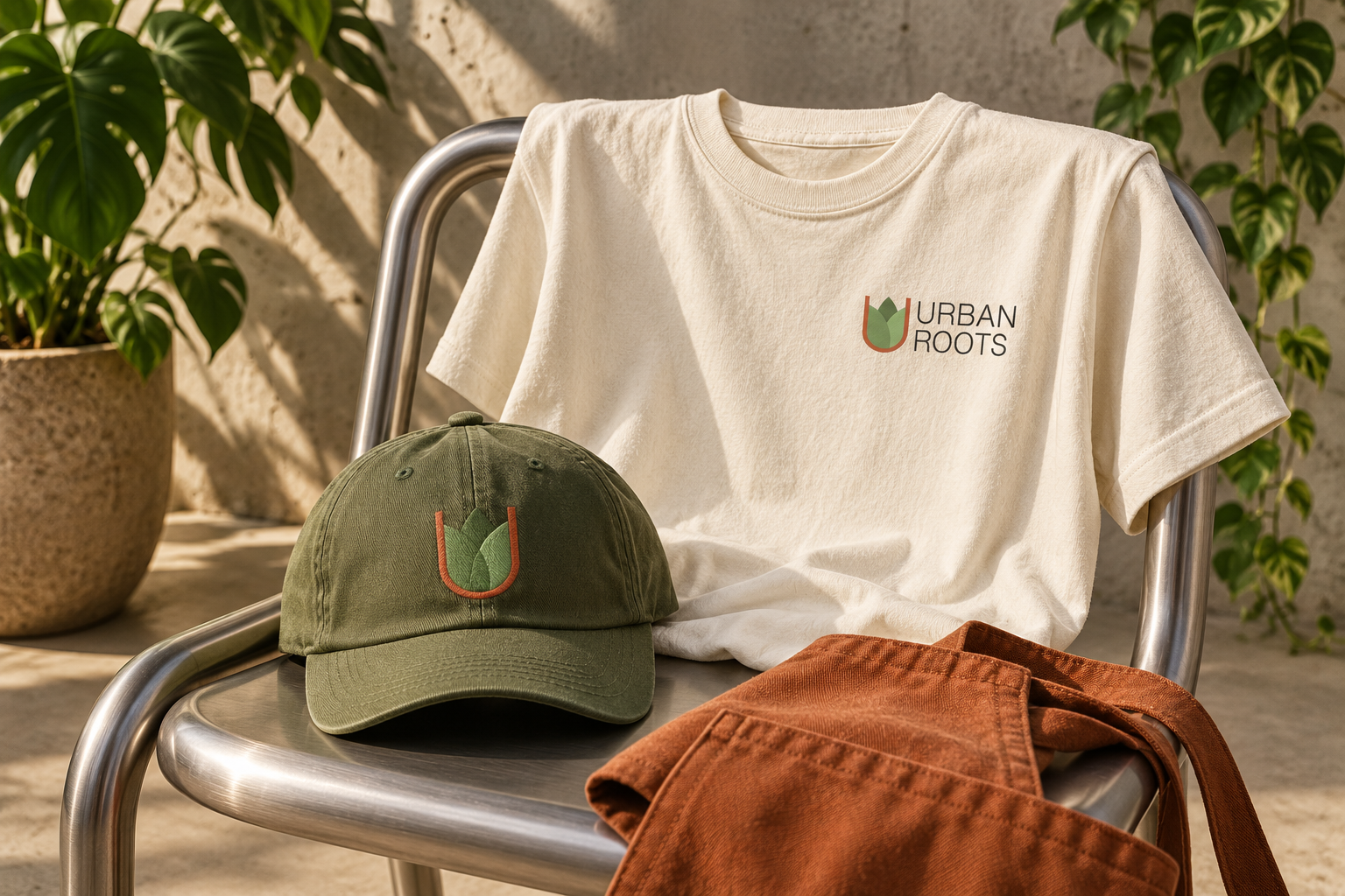
Apparel
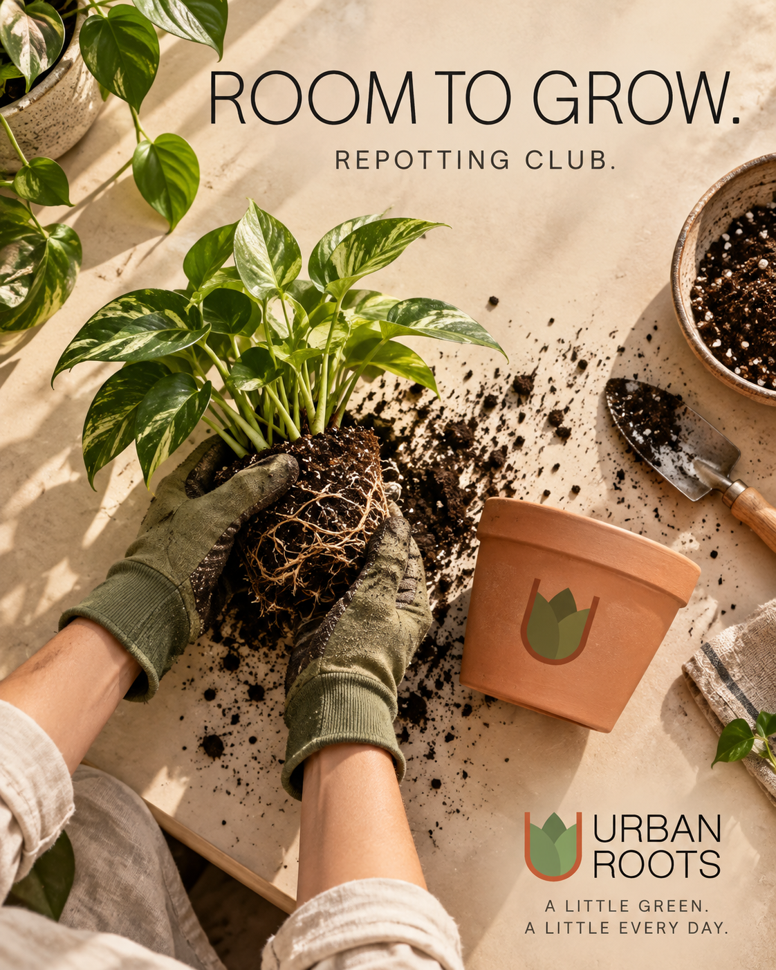
Campaign
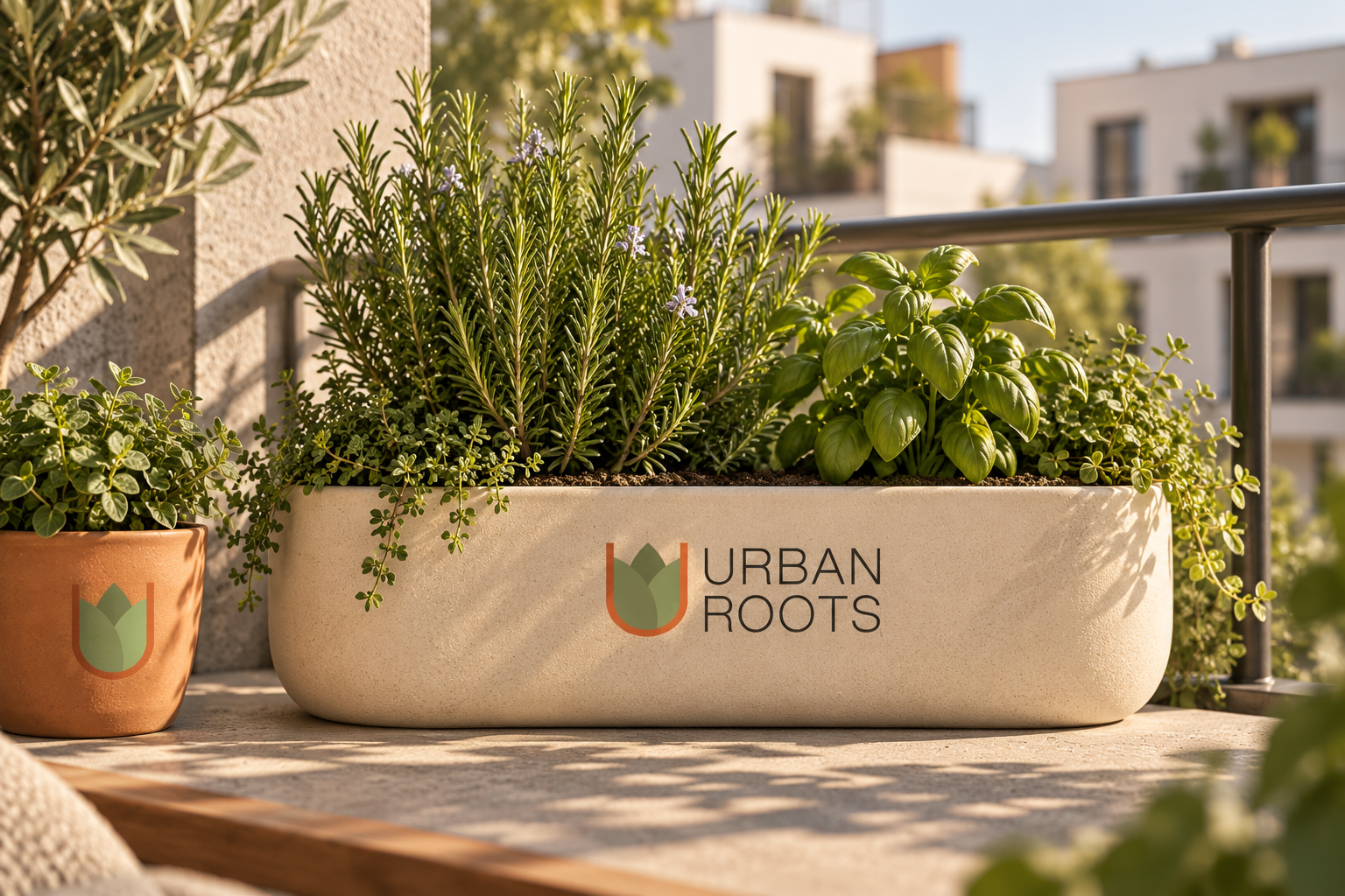
Branded planters
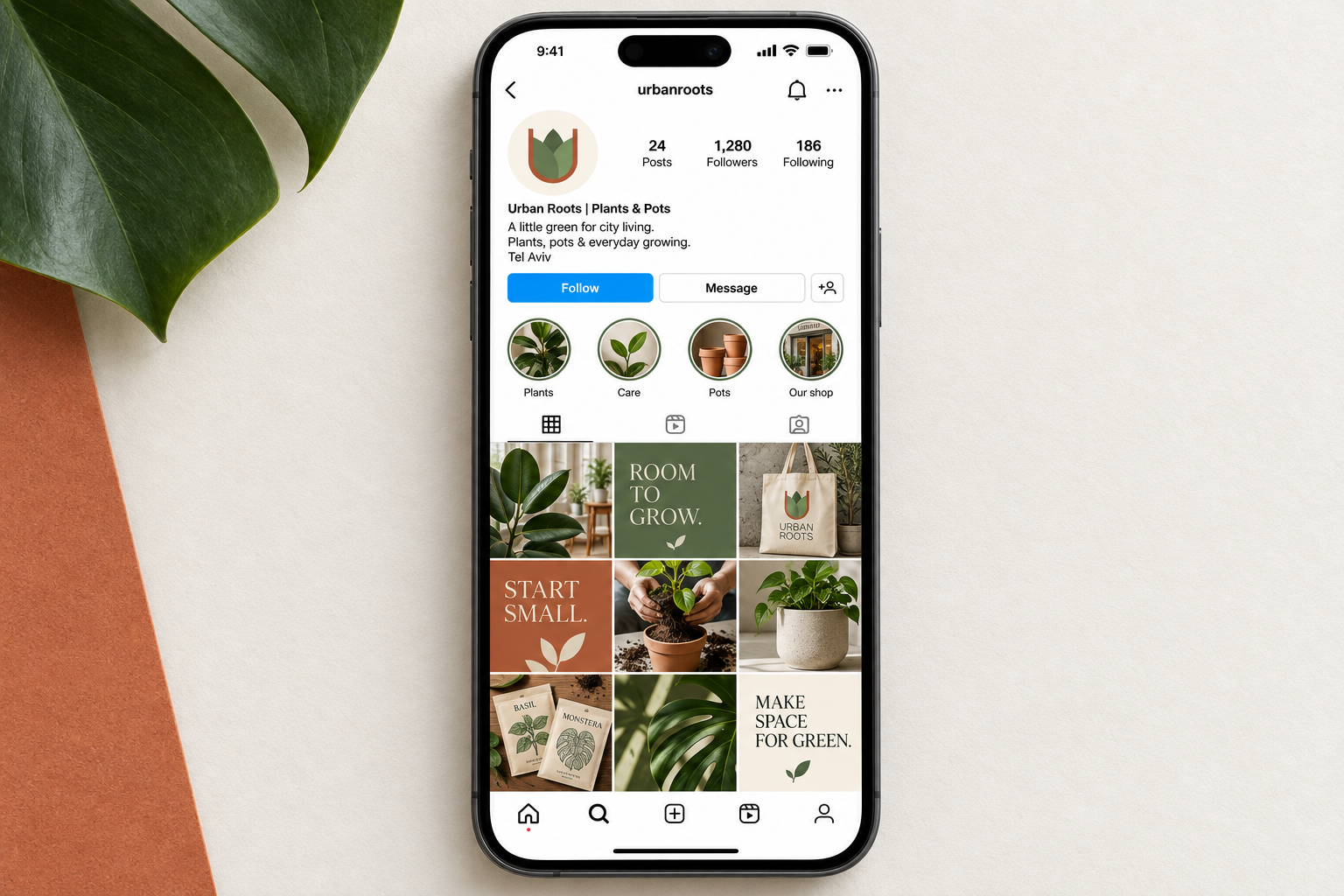
Social media
Outcome
A cohesive identity that combines city-inspired geometry with the color and texture of plants.
What shipped
- Logo and visual identity
- Color and material palette
- Typography system
- Brand applications