Brand strategy and identity
Vitalyze
Brand identity for a precision nutrition business.
- Year
- 2025
- Industry
- Health technology
- Deliverables
- Brand strategy, Logo, Visual identity, Packaging, Advertising

Making a technical idea easy to understand
Vitalyze’s brief centered on nutrition informed by biomarker analysis. The identity needed to make that technical focus understandable across packaging and brand materials.
Give the science a clear visual language
A mark that repeats as a pattern and a label written for each customer’s formula give the technical story a clear visual reference. A bright green accent gives the system a consistent point of recognition.
A mark that becomes a pattern
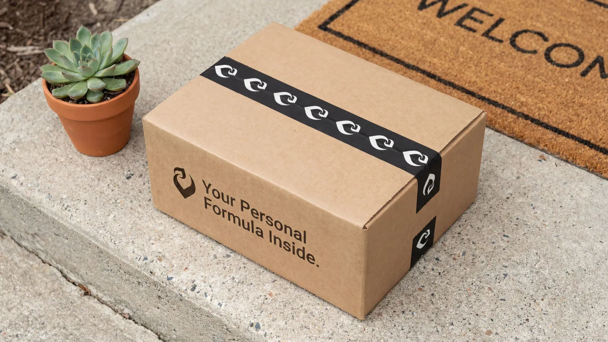
The leaf mark works on its own and as a repeating pattern, here along the packing tape, so the packaging and the supporting materials share one rhythm.
Green as the visual anchor
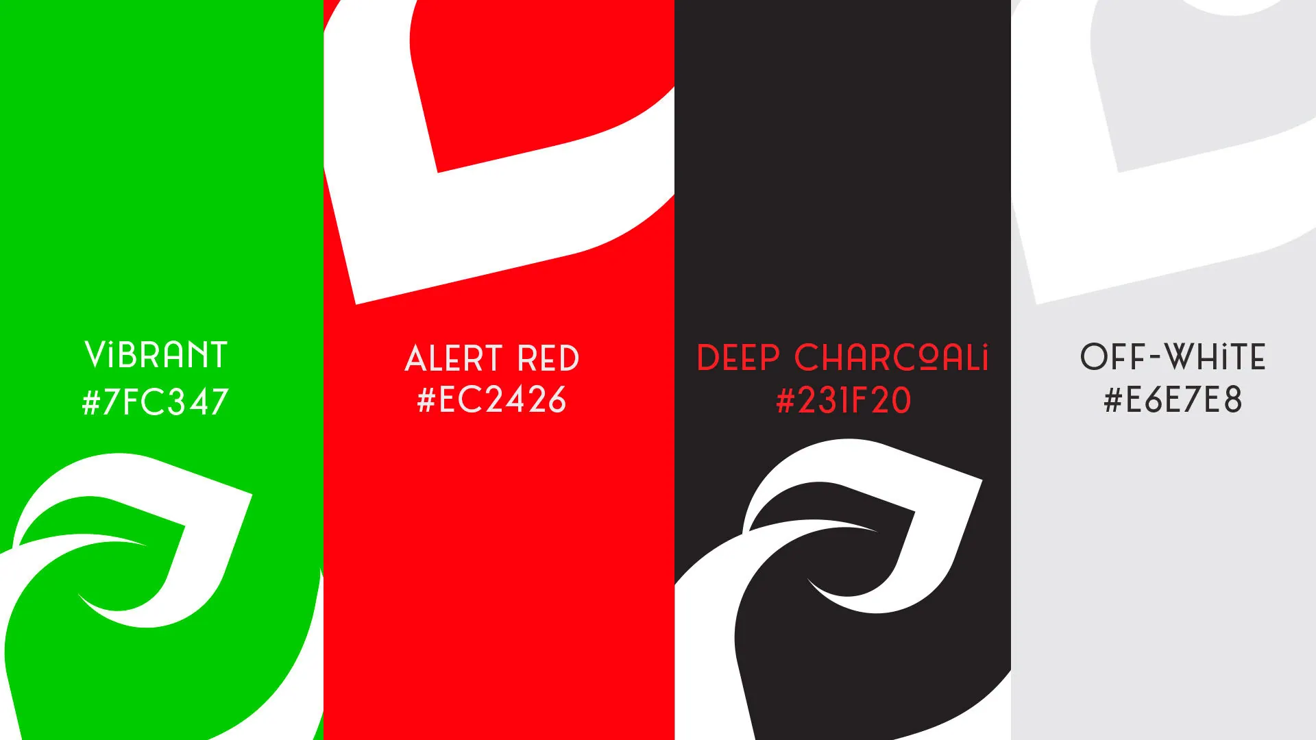
Vibrant green leads the palette, set against deep charcoal and off-white, with a red kept for alerts. The green highlights key elements while keeping each composition clear.
Packaging built around the capsule
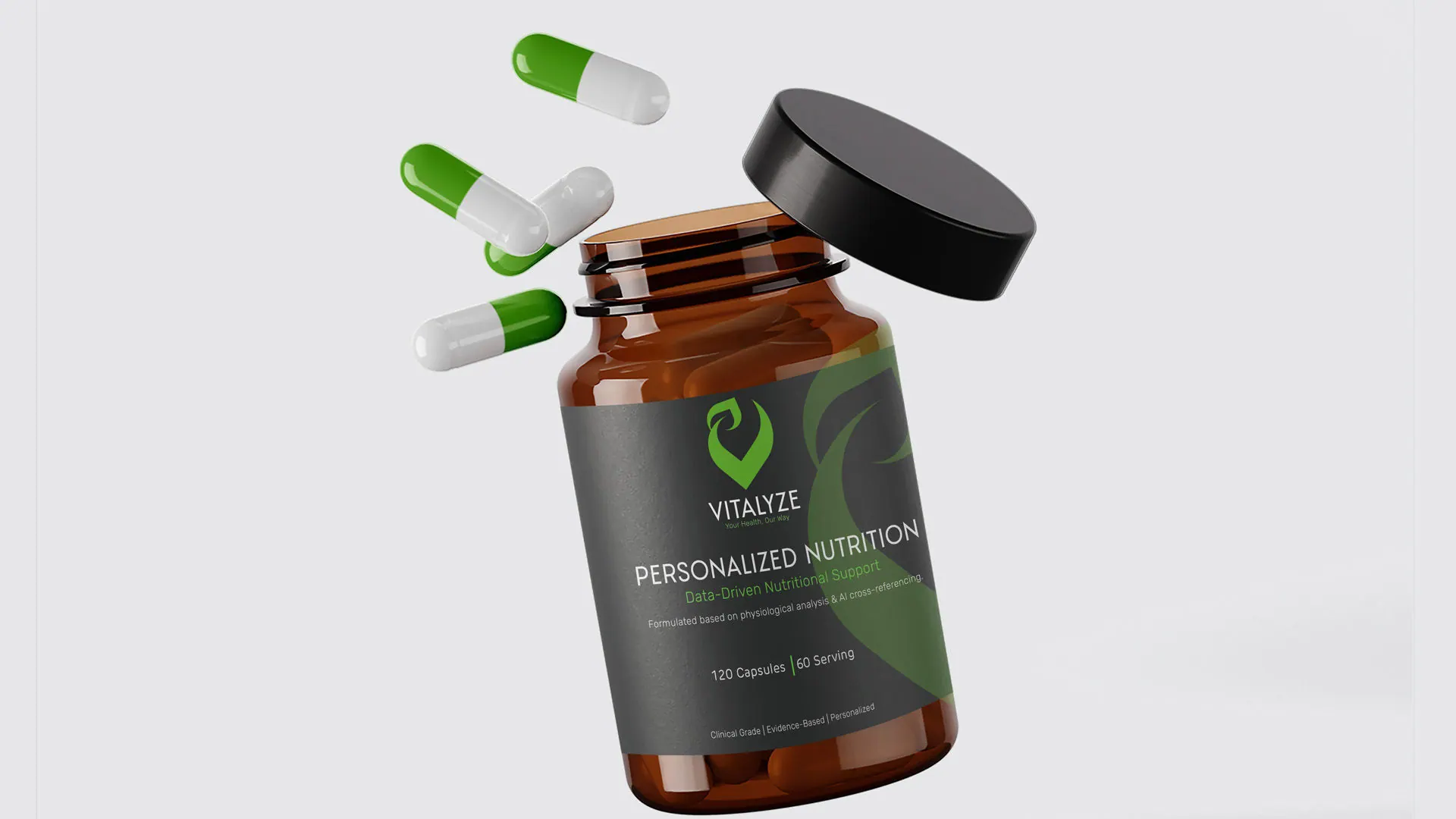
The capsules lead the product imagery, spilling from an amber bottle whose label carries the mark and the words Personalized Nutrition.
Brand applications
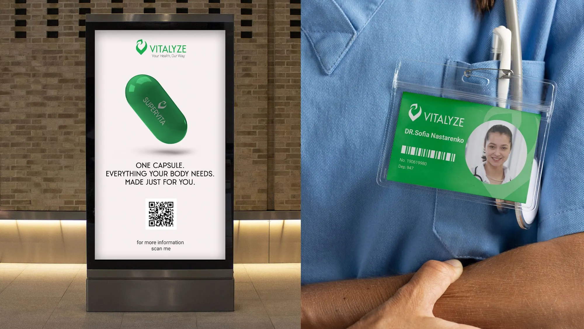
Poster and staff badge

Brochure
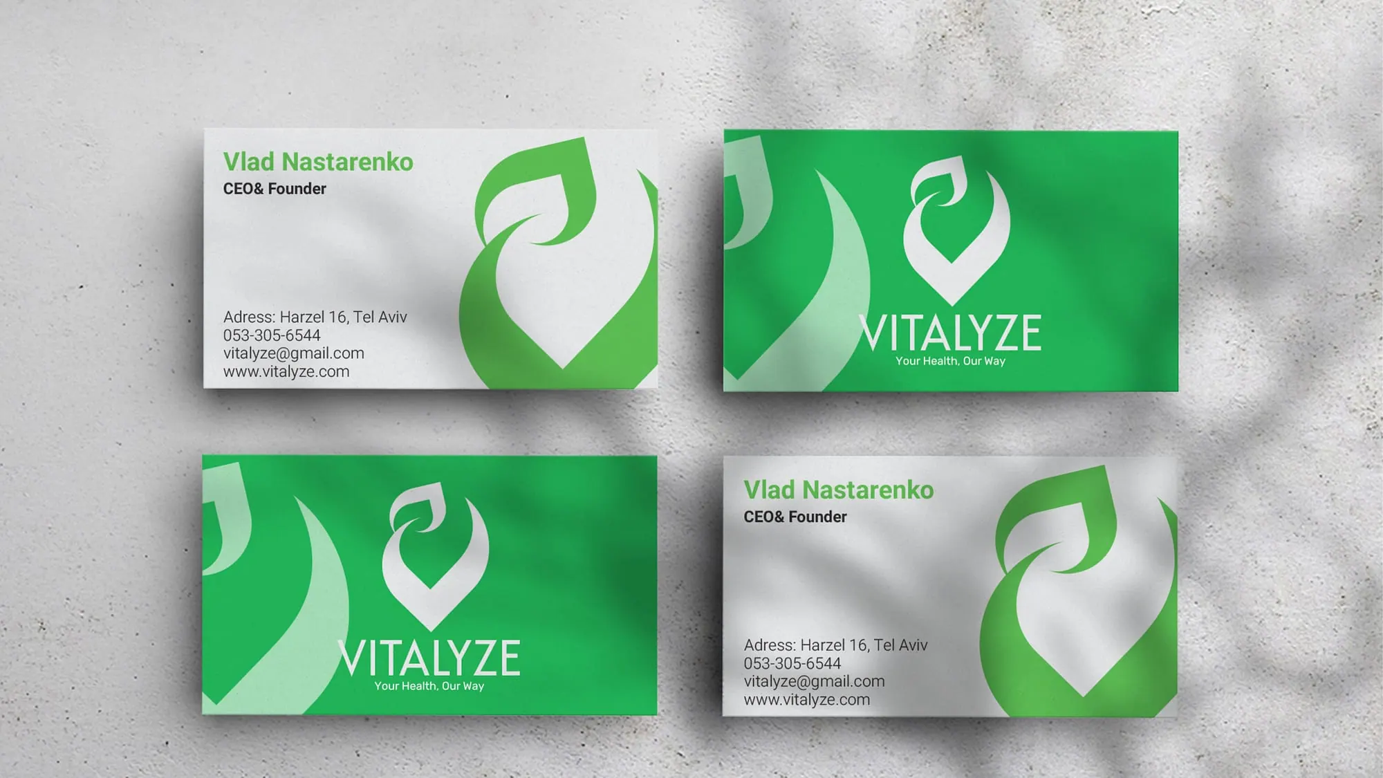
Business cards

Personal formula label

Bottle cap
Outcome
A coordinated identity and packaging direction that gives Vitalyze’s technical concept a clear visual presence.
What shipped
- Brand strategy and positioning
- Logo and visual identity
- Packaging and capsule design
- Advertising creative